
|
|
|
ChartGraphics -- Operations & Use
Use ChartGraphics software with ready-to-use U.S. national scope U.S., state and county data to create your own population pyramids. The following view shows the ChartGraphics user interface when used to display the data for Santa Clara County, CA. An optional setting enables the user to publish the population pyramid and associated age-gender population by age table as shown in the above graphics. The resulting published data is in HTML structure and ready to integrate into your documents. As shown in this view, you can easily select the year, race group and geographic area of interest. This section provides information on operation and use of ChartGraphics. 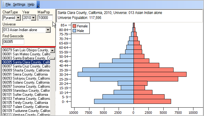 Click graphic to view as HTML. Sections in this document: • User Interface • Video Overview • Gaining Insights • Operations • Output and Analysis • Charts Datasets • Race/Origin Population Universes • Installation & Updates User Interface Details in this scroll section describe structure and use of the user interface screen shown in above graphic.
After installation, start
Main Menu - File: open Charts Dataset - Settings: Percent - if checked, show bar charts as percent ---- Export2XLS - if checked, Charts XLS file is created ExportShowXLS - if checked, Charts XLS is displayed in Excel (requires Export2XLS checked) Export2HTM - if checked HTML and pyramid graphic are created ExportShowHTM - if checked, Charts HTML displayed in browser (requires Export2HTM checked) ---- Form Adjustable - if checked, enables resizing of Charts window Reset Form Size - click to set form size to start-up form size. Control Panel (left) - ChartType: only Pyramids operates in standalone version - Year: select 2000 or 2010 for the default database Year is available annually for 2000 through 2060 when using the S&O Outlook 2060 database - MaxPop: maximum population setting for any one gender population bar MaxPop value enables use of a fixed setting for comparison over time or between areas If zero, the X-axis maximums are determined by the maximum of the set of age cohort populations - Universe: Race/Origin Population Universe (see list) - Find Geocode: key in state+county FIPS to locate; press enter; geography shows in listbox - Geography Listbox: list of available geographies included (U.S., states, counties) - dbl-click geography in listbox at left to show pyramid Charts Panel (right) - view population pyramid View Narrated Video Overview of using ChartGraphics ... view video. Gaining Insights The population pyramid helps us understand the age and gender structure of a population in a specific area, like a county or state. The shape of the pyramid can show the potential for future growth and provide hints about past trends. A top-heavy pyramid suggests negative population growth that might be due to many factors, including high death rates, low birthrates and increased emigration. A bottom-heavy pyramid suggests high birthrates, falling or stable death rates and potential for rapid population growth. The population pyramid shows a male population bar chart (left side of pyramid, blue) symmetrically with a female population bar chart (right side of pyramid, light red). Each bar shows the population by 5-year age group, 0-4 years to 80-84 years and 85 years and over. Operations ... gotop To generate a pyramid view for an area, dbl-click the area code/name in the listbox in the left panel A new pyramid view is also shown when a change is made to the Year selection or the Race Group selection. Output and Analysis ... gotop With these main menu Setting items checked on, the pyramid graphic is created and associated age-gender HTML table created and displayed. - Export2HTM - ExportShowHTM Charts Datasets ... gotop The Charts Dataset is the dbase file used by the application. The default Charts Dataset is opened when the application starts. The main menu File>Open may be used to open an alternative Charts Dataset. A Charts Dataset must conform to a specific structure. Default Charts Database Structure (U.S., states, counties)
Records appear in the default Charts Database only if the count for that universe is 100 population or more. The default Charts Database is based on the Census 2000 Summary File 2 QTP1 table and Census 2010 Summary File 2 QTP1 table. Race/Origin Population Universes ... gotop 001 Total population 002 White alone 004 Black or African American alone 006 American Indian and Alaska Native alone (300, A01-Z99) 012 Asian alone (400-499) 013 Asian Indian alone (400-401) 016 Chinese alone (410-419) 022 Japanese alone (430-439) 050 Native Hawaiian and Other Pacific Islander alone (500-599) 052 Native Hawaiian alone (500-503) 062 Native Hawaiian alone or in any combination (500-503) & (100-299) or (300, A01-Z99) or (400-999) 070 Some other race alone 100 Two or more races 400 Hispanic or Latino (of any race) (200-299) Installation & Updates ... gotop ChartGraphics is available at no fee to ProximityOne User Group members. Join now, there is no fee. Click ChartGraphics Installer to install the application on a Windows computer. The standard installer places all software and required files in the folder c:\chartgraphics. ChartGraphics data may be located on a shared access server; this is an optional separate step and not recommended. The basic U.S. by state and county ChartGraphics dataset is 19MB. Total required disk space is 30MB (including all data and software). The software itself must be installed on a desktop/laptop. After installation, Internet access is required only for accessing online documentation (this section and examples). Follow the prompts and take all defaults. Additional Information ProximityOne develops geographic-demographic-economic data and analytical tools and helps organizations knit together and use diverse data in a decision-making and analytical framework. We develop custom demographic/economic estimates and projections, develop geographic and geocoded address files, and assist with impact and geospatial analyses. Wide-ranging organizations use our tools (software, data, methodologies) to analyze their own data integrated with other data. Follow ProximityOne on Twitter at www.twitter.com/proximityone. Contact us (888-364-7656) with questions about data covered in this section or to discuss custom estimates, projections or analyses for your areas of interest. |
|
|